NANDOS PECK & PLAY
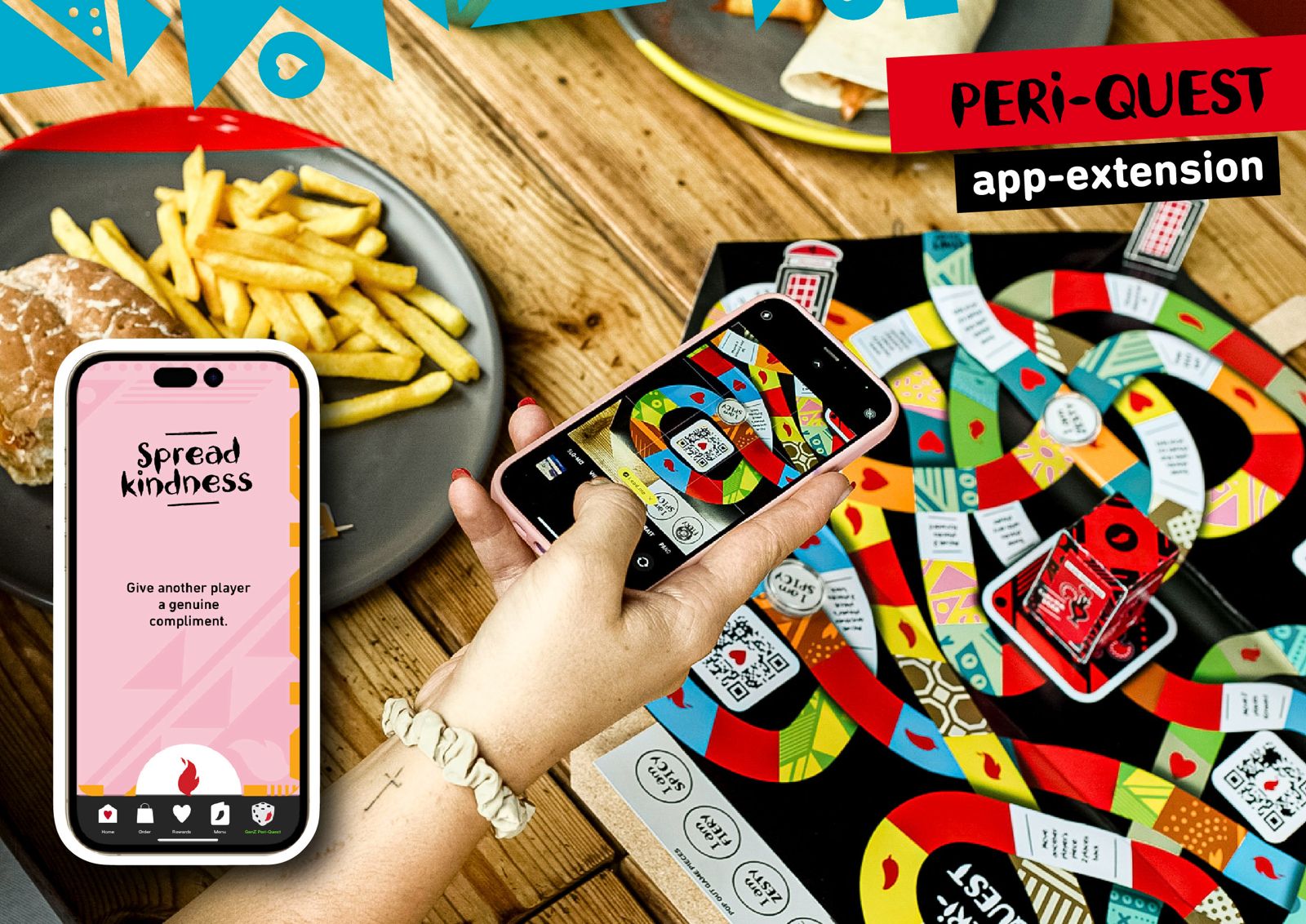
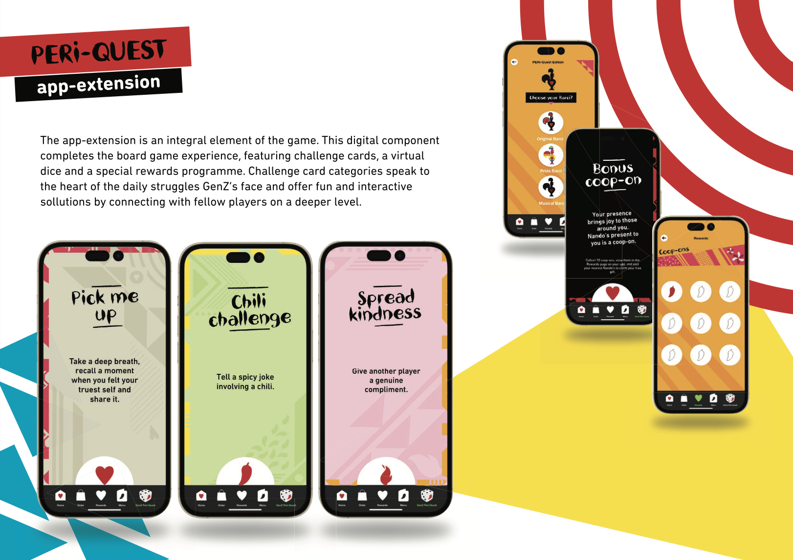
The app was created for The Express Your Per-Peri Campaign which aims to create a culture of inclusivity, belonging, and expression. This campaign provides a platform for GenZ's to celebrate their individuality through self-expression and building meaningful relationships. This helps to bridge the gap between the feeling of isolation and the conviction of belonging. The players spin a virtual dice within the Nando's app and guide their token along a pathway. When landing on Nando's symbols - the heart, flame, or chilli, players can scan the corresponding QR code on the board which unlocks virtual challenge cards on the Nando's app. The first player to land on the center of the board claims a mystery box...This contains one of five exclusive collectible Barcelo cockerels, adding an element of surprise and excitement to the game experience! The app-extension is an integral element of the game. This digital component completes the board game experience, featuring challenge cards, a virtual dice, and a special rewards programme. Challenge card categories speak to the heart of the daily struggles GenZ's face and offer fun and interactive solutions by connecting with fellow players on a deeper level.
Uber Eats UX Design
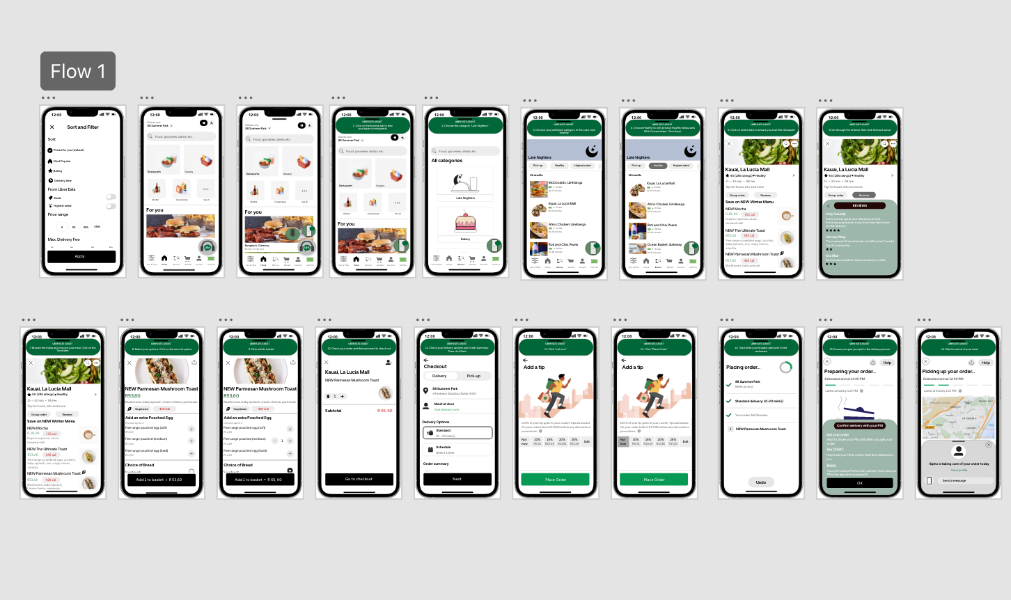
The challenge for this app was to create an inclusive and accessible user experience for everyone. I thoroughly enjoyed designing the app, especially adding new features like a step-by-step guide, a progress bar, a virtual assistant, clear instructions, and sections tailored for specific needs. Working with the brand's colour palettes and typography was a delight, and I constantly sought feedback to ensure continuous improvement based on user preferences.
Starbucks UX Design
For this project, I focused on enhancing the user experience of Starbucks' website, particularly the drink menu. I wanted to make the browsing process more engaging and user-friendly, especially for those who are health-conscious or gym-goers. By redesigning the menu, I incorporated interactive features that allow users to click on a drink, and instantly see a larger image with more detailed information. Each drink's block expands to showcase not only its ingredients but also essential information such as calorie content, making it easier for users to choose drinks that align with their fitness and health goals. This feature aims to support customers who are conscious about their calorie intake while still enjoying the wide range of drinks Starbucks offers. The design ensures a seamless and enjoyable experience, with an intuitive layout that encourages exploration and discovery. The UX design is focused on simplicity and ease of use, ensuring that users of all ages and technical backgrounds can navigate the site effortlessly. The goal was to enhance the website’s interactivity without overcomplicating the interface, ultimately creating a more personalized and relevant shopping experience for users.
Bose UX Design
The Bose website, despite being a renowned brand in the tech and music world, lacked the visual appeal and interactivity one might expect from such a premium brand. As a fan of Bose's sophisticated digital headphones, I took the initiative to redesign the website to better reflect the brand’s premium nature while enhancing the user experience (UX) and interface (UI). My primary focus was on one of their flagship headphones, adding personality and flair to its presentation. The original website felt too plain and colorless, predominantly using white, which didn’t do justice to Bose’s high-tech and sleek products. I introduced a grey and black gradient to maintain the brand’s original color palette while making the website visually appealing. I then added vibrant color options for the headphones that are fun and engaging, allowing users to interact with the product as they explored different color choices. In the redesign, I used a smooth transition effect where the headphones visually follow the user’s interaction with the page. When a user clicks on a color from the switch panel, the headphones' color seamlessly changes, providing instant feedback and a sense of dynamic interaction. Each color also comes with a description explaining its significance and how it connects to the overall product experience, allowing users to make an informed decision while having fun with the interface. The UX design focuses on making the process intuitive and user-friendly, especially for visitors who are both tech-savvy and those new to Bose products. The layout is clean, with easy navigation and a focus on showcasing product details in an interactive and engaging manner. This redesign not only gives the Bose website more personality but also makes the product exploration more enjoyable and informative for users, turning a simple browsing experience into something that truly connects with the audience’s love for music and technology.
Off-White UX Design
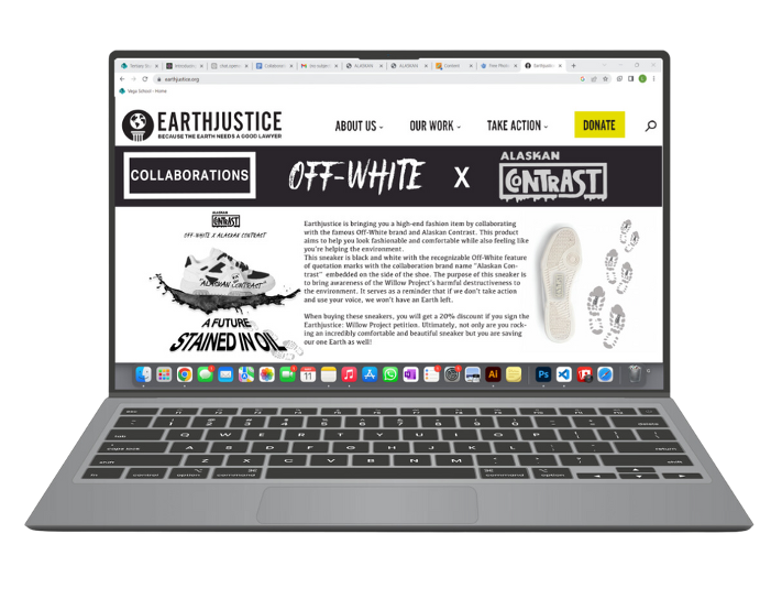
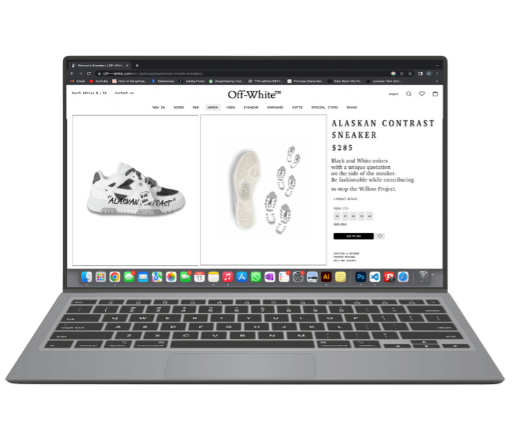
This project involves designing a creative solution for the Creative Conscious Awards in the Climate Crisis category. The goal is to address the environmental impact of the Willow Project, specifically focusing on the reversal of Biden's oil drilling ban in Alaska. By emphasizing the urgency of the situation and the betrayal felt by the audience, the concept behind Alaskan Contrast is to motivate action through guerrilla marketing, brand collaborations, and social media campaigns. These efforts will encourage people to sign petitions, protest, and advocate against the government's decision, ultimately pushing for change and collective action against environmental harm. This project also incorporates a unique product that directly ties into the campaign's message: a limited-edition Off-White shoe designed with oil patterns, symbolizing the environmental damage caused by oil drilling. When people visit the website, they will have the opportunity to purchase these exclusive shoes, which not only support the Alaskan Contrast campaign but also serve as a tangible reminder of the impact of oil drilling on our daily lives. As people wear the shoes, the oil patterns on them become a conversation starter, raising awareness and sparking discussions about the environmental consequences of projects like the Willow Project. Each step taken in these shoes serves as a visual protest, bringing the message into everyday spaces and encouraging individuals to think critically about the materials and industries that affect the environment. The combination of fashion and activism provides a creative, impactful way for consumers to actively engage with the issue and support the campaign.


